In what ways does your media product use,
develop or challenge forms and conventions or real media products?
From my research of the Horror genre, I found out there are lots of conventions linked with Horror. These include characters, settings, themes and editing. When planning and making my products I tried to incorporate these conventions but also challenged them to give my products something unique for the market. For example we challenged some conventions of settings when we took the dark, sinister scenes of Horror films and transported them to light, normal looking places, settings in which every member of our audience can recognise and relate to. However, we still did use the cliché horror chase scene through the woods at night. We tried to run the theme of familiarity through our trailer to keep the audience on the edge of their seats and make them feel even more scared as it was horrific things happening but in an environment that they can easily relate to. Furthermore we challenged some conventions through the use of our characters, as we didn’t use many stock characters. This included our protagonist killer, who we didn’t tell the audience who it was, only hinting at who it could be. We achieved this by having a split screen, with the victim to the left and the killer to the right side of the screen. This ensured a sense of obscurity, a main theme of our trailer, so the audience knew as little as possible but just enough to intrigue them in going to the cinema to find out how the characters are being killed and who is doing the killing. We also used a wide range of age groups, ranging from 11 upwards rather than focusing on the normality of ‘slasher’ films being based around teenagers. Moreover, we challenged the stock character of the ‘Final Girl’ turning ours to be a possible killer, shown through the shot of her turning round to face the camera. Additionally we challenged conventions by taking all our sound out so there was no dialogue in the trailer at all, but we used the convention of Horror trailers of a focus on the music and sound effects. I composed a traditional creepy piece of music for our trailer, using the conventions of a normal Horror trailer.
For my magazine, I used many conventions taking my inspiration from ‘Empire’ magazine, but developed them by turning it into a fully Horror magazine. I took the style of image and layout from ‘Empire’ as it already works effectively for the audience. I developed conventions by having the title of my film on the magazine cover in the font from the film, rather than a magazine font, this was so my target audience would be able to recognise it quickly on the shelf. I challenged conventions on my magazine cover through my image, having the character Veronica facing away from the reader. Most magazines have the actor facing out to the reader, but keeping in line with obscurity I changed this and hid her face having her facing away behind her from the reader.
I also used many conventions for my poster, keeping the similar layout to many posters on the market, with the credits, age rating and a link to a social networking site. However, again I challenged conventions through my use of obscurity, ridding most of the image but my characters eyes, so the viewer does not know who it is looking at them. I also developed conventions by having two different colours split on my poster, with a green background on one side and black on the other. The green connotes poison, but also suggests two different sides for this particular character, that maybe they have a Jekyll and Hyde personality.
How effective is the combination of your main
media product and ancillary texts?
I tried to combine all my media products effectively so everyone would know they were from the same film, to do this I incorporated bits from each product into the other. The main thing I incorporated was the theme of obscurity, using the enigma effect throughout all 3 products. In the trailer I achieved this by making in confusing as to who the killer is, on my magazine cover the character Veronica is faced away from the reader and on my poster everything is hidden but the eyes making it unknown to the viewer as to who it is. However, I also used the enigma effect by having many people feature in the different products so they don’t link in a sense making it the obscurity stronger. In the trailer we hint at many different characters to being the killer, then in my poster I’m hinting at Alice, but on my magazine I’m hinting at Veronica. This makes it confusing for the reader, so there is a combination throughout the 3 texts that we don’t know who the killer is and we keep getting new hints, but also no links because one person is not the main image for the film. Furthermore I used the same logo for the title on all 3 products, for example it appears twice in the trailer once at the beginning and at the end, and it appears clearly on both my magazine cover and poster. Furthermore, I had a colour theme of the deep red, connoting the colour blood. It appeared in the trailer as background and text colours. On my magazine cover, it is both the title ‘Fright’ colour and in other places. And on my poster I used it as the colour for my text, making it obvious that these 3 products are all linked to one another.
I tried to combine all my media products effectively so everyone would know they were from the same film, to do this I incorporated bits from each product into the other. The main thing I incorporated was the theme of obscurity, using the enigma effect throughout all 3 products. In the trailer I achieved this by making in confusing as to who the killer is, on my magazine cover the character Veronica is faced away from the reader and on my poster everything is hidden but the eyes making it unknown to the viewer as to who it is. However, I also used the enigma effect by having many people feature in the different products so they don’t link in a sense making it the obscurity stronger. In the trailer we hint at many different characters to being the killer, then in my poster I’m hinting at Alice, but on my magazine I’m hinting at Veronica. This makes it confusing for the reader, so there is a combination throughout the 3 texts that we don’t know who the killer is and we keep getting new hints, but also no links because one person is not the main image for the film. Furthermore I used the same logo for the title on all 3 products, for example it appears twice in the trailer once at the beginning and at the end, and it appears clearly on both my magazine cover and poster. Furthermore, I had a colour theme of the deep red, connoting the colour blood. It appeared in the trailer as background and text colours. On my magazine cover, it is both the title ‘Fright’ colour and in other places. And on my poster I used it as the colour for my text, making it obvious that these 3 products are all linked to one another.
What have you learnt from audience feedback?
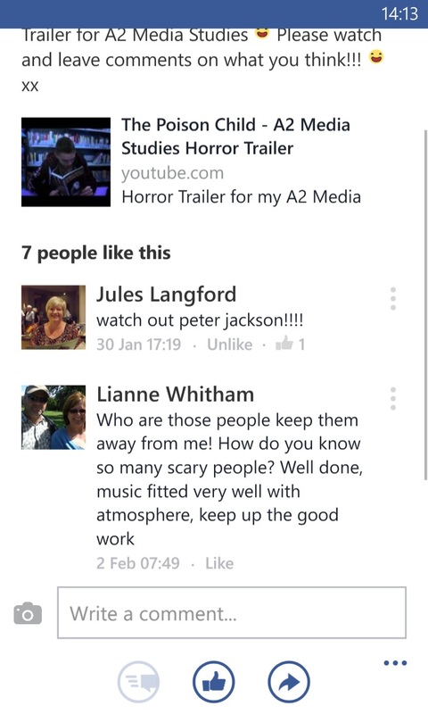
To hear what our audience thought about our trailer, we had a showcase in which we had people fill out questionnaires and we also put it up on social networking sites to hear from our peers who didn't attend the showcase. Below is the results and feedback we received from both.
Questionnaire:
To hear what our audience thought about our trailer, we had a showcase in which we had people fill out questionnaires and we also put it up on social networking sites to hear from our peers who didn't attend the showcase. Below is the results and feedback we received from both.
Questionnaire:


|


|


|


|
Social Networking:

|


|


|
I have learnt a lot from this feedback, both from the questionnaires and from social networking sites. Firstly, the majority of people who viewed our trailer said they thought it was good, that it fit the horror/thriller and that they would go and see it in the cinema. This meant that we had achieved what we had set out to do, fulfilling our brief. We also learnt that what people liked most in our trailer was the scream and music, which seems to be the bits which people loved most. This was great feedback, as we wanted a lot of focus on the soundtrack as we didn't have any dialogue. Also to know that the scream worked well was good, as its the only sound in the whole of the trailer, and we wanted to create a jump for the audience as they wouldn't be expecting it. The bits which people liked least was that they were unsure of the plotline, and where it was going. I would not change what we did, as we wanted the enigma effect, to encourage people to go to the cinema and find out what was going on, and even though people didn't like this, they all said they wanted to go and see the rest of the film. They also didn't like the speed of the shots, there was a mix with these views as some found scenes too slow where others found them too quick to keep up. If I was to re-do this I would find out specific shots and play around with the speed of them o make the trailer clearer. There were also mixed feelings over the title sequence, most people liked it but found it was too slow, I would keep this shot in as it denotes the young child killer. I would however try re-writing it in a different way to speed it up but so it still looks realistic. Most people also said that our killer was 'unclear' or even 'unsure', this was good as we didn't want people to know who our killer was, making them want to go and see the film at the cinema in order to find out. A few said they knew who the killer was, and it would be interesting to ask them who they thought it was in order to change it to make it even more unclear as to who it is. Everyone we spoke to about our trailer said the most iconic scene was the blood scene, a vibrant colour against the very monotone colours of the rest of the trailer. This was our only explicitly gory/horrific scene in our trailer and its great feedback to know that it imprinted an image on our viewers. They also liked the scenes where the 'possible' killers turned to face the camera, this also created the enigma effect, suggesting different people for the killer. It was great that people liked these scenes as they were the main body for our trailer, moving suspicion from one person to another. This again encouraged our viewers to say that they would like to go and see our film at the cinema. Overall 88% of the people we spoke to said they would go and see this film at the cinema, this shows that our trailer was a great success, fulfilling the brief. One of the three who said they wouldn't go and see the film at the cinema said this was because they did not like horror films and were scared too much by the trailer to see the whole film. The feedback was great and if I had the chance to do this task again, I would not change much as I believe our horror trailer was a great success.
How did you use media technologies in the construction and research, planning and evaluation stages?
It was during the construction of my trailer, magazine cover and poster in which I used the most variety of different media technologies. For the trailer, I used two different cameras to film, this meant I could film the same scene from two different angles at the same time. This saved a lot of time, and made it a lot more efficient. Also one of the camera's I used was a new Canon, which had a touch screen. This meant when I tapped on the screen the focus would be on that particular object and blur the background out. I used this function for the shots where our possible killers turn to face the camera. This meant I could easily blur out the background and have all the focus on the characters. The same camera had the ability to change the contrast and brightness on the actual camera, this meant I could darken an image as I shot the scene rather than later on the computer, I used this function during the library scene. To put the trailer together I used a few different programmes. The main bulk of the trailer was put together on Adobe Premiere Pro, which is where I was able to crop the shots together, edit them and alter the images, for example the last scene when we gradually blur the scene to make it look like the person screaming is also tearing up. I also used Premiere Pro when I edited so I had two shots playing at one time, this took some time to get used to, but eventually worked out how to crop an image and overlay it so they both played at the same time. This was used for the scenes where a possible killer turns around to face the camera at the same time a victim dies. I also used Adobe audition which was when I plugged the keyboard into the computer and recorded a theme for the trailer. This programme also allowed me to edit the music, changing the length and speed. It was also very helpful as I needed to record two parts so I could record the base layer first then re-record over the top to get the main tune. Another programme I used for the trailer was Quick Time Player, this was used to record any extra sounds, at the beginning we had more sound but later changed this in the trailer so the only sound is Veronica screaming at the end of the trailer, which was recorded on Quick Time Player then placed over the top of the trailer.
For the creation of my poster I used Photoshop, as It meant I could easily alter the image, edit it but also add text on the top of it. It also meant I could also manipulate the image, rubbing certain areas out and add colour to only half of the page. I also used Photoshop to make the image for my magazine front cover, I chose to do it on Photoshop, as I knew how the programme worked, and I knew I could easily edit and manipulate an image to what I wanted. Once I had the image however I put it into Adobe InDesign to put the whole thing together. This meant I knew the correct dimensions, and that I could place everything in right places.
I used less media technologies in the subsequent stages. For the research stage, I used the internet and an online survey system to gather different information. This meant I could quickly and efficiently gather a wide range of different information that would assist me in fulfilling my brief. For the planning stage I again used the internet, and various programmes on the computer. This included Premiere Pro which I used in the production of our Preliminary Task, as well as learning how to use a camera. This gave me the basic knowledge I needed for the main task of creating our Horror trailer, making the task slightly easier when I needed to complete it.
For the Evaluation stage, I used the internet, mainly for Social Networking sites so I could gather feedback on my trailer. This meant a wide variety of people could view my trailer and I had a wide variety of feedback from our target audience.
Throughout this entire project, I have been using this website, to document my progress. It allowed me add pages for each of the different stages as well as adding text, pictures, links from Youtube and my own documents. This made this project very efficient as everything could be kept in one place, but I could also access all my work every where. It also made it easier for me to evaluate my work as everything was in the same place and I could make different judgements about things.
Overall, I have learnt to use a wide range of different media technologies over this course, for all the different areas, developing my skills in all the programmes and in the different camera equipment.
